

image is everything
“The conscious and intelligent manipulation of the organized habits and opinions of the masses is an important element in democratic society.”
- Edward Bernays, Propaganda (1928)
Perspective isn’t passive - it’s controlled.
Branding that seizes attention, builds belief, and commands respect.
I craft visual systems that don’t just look sharp - they influence behavior, embed meaning, and endure across product, print, and pixel.
Your brand’s narrative becomes undeniable.
Explore case files that turn theory into traction real-world branding and identity solutions in motion.
the Philosophy in Action

These three free case files show how ideas become impact.
Each one breaks down how strategy, storytelling, and design align, to create influence and real-world identity solutions.
Use the quick links to jump straight to what resonates.

you are what you wear
the culture
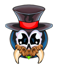
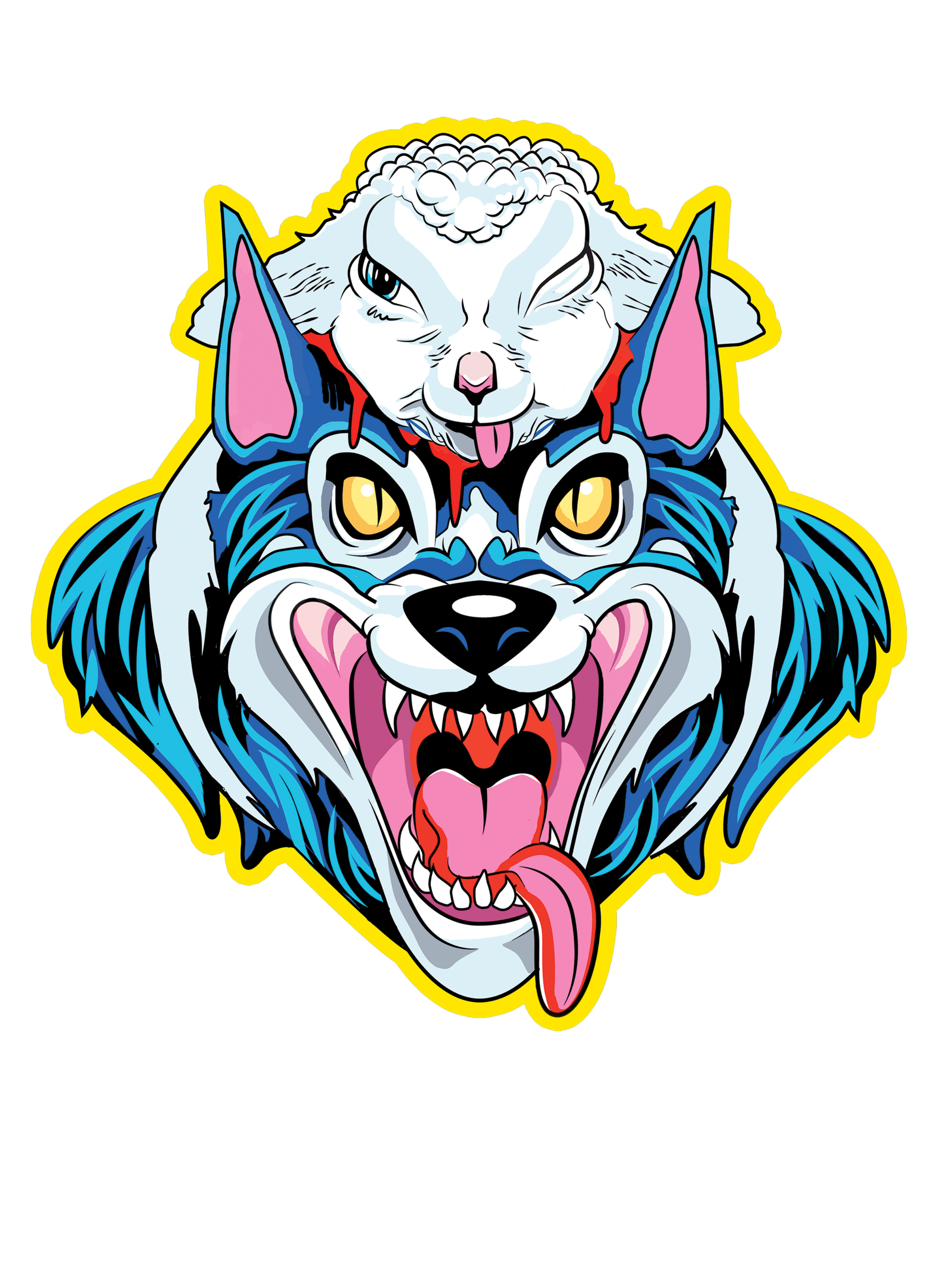
Before the first shirt ever dropped, this brand could walk into a room and own it.
Flytrap was built with the confidence of streetwear and the cunning of a cartoon villain, made to stick in your head like a great hook or a buzz saw. It doesn’t whisper; it carves space.
Every creative decision flows from that ethos. Every asset serves a purpose: to punch through the noise, mark territory, and make damn sure you remember who made it. Because visual identity isn’t decoration , it’s fly shit for fly people.
intention
-
Developed a layered aesthetic blending graffiti textures, ‘90s cartoon linework, and distressed typography.
Created modular graphic assets for quick remixing across digital and screen-print formats.
Print assets optimized for garment contrast and high-speed production.
Merch mockups and campaign visuals built in Cinema 4D and After Effects.
-
Built animated logo bumpers for Flytrap reels and ads.
Created GIF and video loops optimized for Instagram and Facebook release windows.
Hand-rigged monster icons for playful motion bursts used in teasers.
-
increased brand visibility and marketplace recognition
Cohesive storytelling from concept to execution
Faster audience recall through bold, character-led design
Elevated perception through professional polish and consistency
Built-in flexibility to evolve without losing brand identity

visual identity
Loud. Sharp. Unmistakable.
Flytrap doesn’t blend in: it bites. The identity system was designed to command attention from the first glance: thick lines, aggressive contrast, and color combos that buzz. Every logo, glyph, and frame of motion was crafted to echo the brand’s voice, the chaotic charm, streetwise wit, and unapologetic presence. This isn’t just a look. It’s the mask the monster wears.
brand bible
Toxic Red
#C00000
Primary accent (logos, key visuals, emotional punch)
Asphalt Black
#111111
Primary accent Cool contrast tone, iconography, illustration base
Spraycan White
#F2F2F2
Primary accent Negative space, visual clarity, clean UI moments
Primary accent Supporting type, shadow tone, neutral fill
Sticker Grey
#666666
Batman Blue
#1C3F94
Primary accent Backgrounds, outlines, core typography
Hazard Yellow
#FFDDOO
Primary accent Energy accent, call-to-action tone, graphic overlays
-
Headers / Logos: Impact, Bebas Neue, or custom type with aggressive, high-street lean
Body Copy: Inter, Roboto, or Montserrat neutral and legible without losing style
-
Urban decay textures (spray, grit, concrete)
Mascot illustrations cartoon monsters, bug-like forms
Graffiti-style accents tags, drips, overspray
Playful violence webs, traps, teeth—but all stylized
-
Looped Animation Style: Retro bumper vibes, tactile loops, grain overlay
Ease Curves: Snappy entrances with overshoot; land with weight
Logo Behavior: Reactive and expanding under pressure; bounce adds memorability
From the color palette to the cadence of animation, every design choice was calibrated to guide perception, imprint quickly, and stay embedded. The success of Flytrap wasn’t luck or trend-chasing , it was a study in aesthetic control. We didn’t ask the audience to look. We made it impossible not to.
“ Guide the plot. Set the stage. Pull the strings. ”
Kinetic
Presence
The brand’s movement wasn’t just aesthetic , it was strategic. From visual rhythm to narrative beats, Flytrap’s kinetic identity amplified its mystique while building recognition and creating trust.
through momentum. Logo stingers, glitch burns, chromatic smears , it all snaps together to reinforce attitude, pace, and punch. This is motion that sells the myth
Flytrap moves like it means it , no filler, just impact. Motion design here isn’t about polish for polish’s sake; it’s about extending identity
the hidden hand in motion
“15 second product reel”
“ Mascot Intro Animtion ”
“Peek Behind the Layers”
The outcome? Motion became momentum. Engagement surged. Familiarity stuck. And when we looked closer, we saw the strings.
So we started pulling and the puppet danced.
Execution
-
Design That Delivered
Familiarity at First Glance: Bold visual forms and consistent linework made Flytrap instantly recognizable — even without a logo. Recognition wasn’t accidental; it was engineered.
A Mascot with a Mission: The brand's central character wasn’t just iconic — it shaped how audiences felt. Supported by a growing cast, it gave the brand narrative control from drop to drop.
Built to Guide Perception: Every element — from color blocking to character gaze — was designed to create tension and pull the eye, establishing emotional priming in seconds.
Flexible by Design: The visual system was made to scale — across tags, video, garments, and packaging — without losing tone or integrity.
Design that Persuades: From the way characters pointed to callouts, to the rhythm of typographic layout, every design element pushed behavior subtly but deliberately.
Impact Backed by Results: Social content featuring these designs saw a 120% increase in reach on Instagram, and contributed to a 23% revenue jump over one quarter.
Style as Strategy: The aesthetic wasn’t a byproduct — it was the product. It created emotional friction that made the brand impossible to ignore and easy to remember.
-
Static brands fade. Flytrap moved literally and the brand’s personality animated itself into the feed, the store, and the psyche.
Motion Is Momentum and Key to Delivering Undeniable Presence:
Tripled unique ad impressions with bold, scroll-stopping content
Boosted content visibility: +120% on Instagram, +45% on Facebook
Expanded utility: assets repurposed for reels, storefront loops, and campaign emails
Controlled rhythm and pacing to match audience energy and prime attention span
-
Audience Familiarity: Viewers recognized Flytrap visuals after a single exposure — animated loops reinforced brand memory through repetition.
Content Performance: Branded content consistently outperformed still posts, commanding longer watch times and better engagement.
Sales Outcome: Motion-supported product drops outpaced static campaigns by 23%.
Cross-Platform Impact: Flytrap maintained brand integrity across every medium — web, social, storefront, and packaging.Helped Flytrap establish early cult-brand legitimacy by offering a recognizable tone and visual fingerprint.
Crafted Continuity


motion moves money
-
![Text that says 'The Fly Trap' with a skull illustration and yellow burst background.]()
Flytray Alt logo
-
![A black silhouette of a person climbing a steep mountain at sunset.]()
mascot bumper
-
![Close-up of a vibrant yellow and orange abstract background with a glowing effect]()
flytrap logo bumper
-
![Logo for 'The Flytrap' featuring bold, stylized text with a an animated skull]()
flytrap logo

The Unseen Masters
Visual dominance, disguised as mystic.
Flytrap wasn’t just built to stand out — it was designed to disrupt passive perception. The brand didn’t shout. It dared them to try and ignore it and that challenge imprinted instantly. The humor. The monsters. The motion. It delivered fast-track familiarity that stuck.
From there, the cat had caught the mouse. A subtle capture. A quiet conversion. Image wasn’t just part of the message it was the message. And Flytrap proved that when your identity is mythic, cohesive, and bold, the audience doesn’t just notice. They obey.

persistent
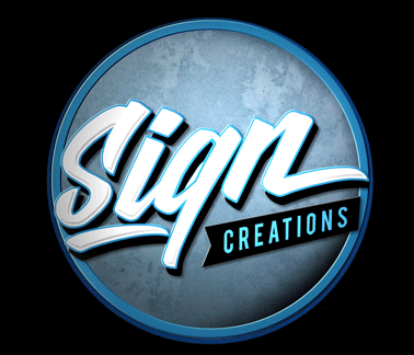
motion
Supercharged engagement starts with the scroll-stopping power of motion. For Sign Creations, a regional signage company with deep craftsmanship and quality, we transformed their online presence through strategic motion design.
Sign Creations:
Motion as Proof of Precision
“60 second process ad”
“ Intro Animtion ”
Moving Parts
A curated look at logo animations and visual accents that brought Sign Creations’ digital presence to life - putting the brand center stage in every frame and giving it momentum with every scroll.

When motion tells the story, the brand speaks for itself.
But what happens when the story needs to sell ?
Let’s find out.
action
Branding
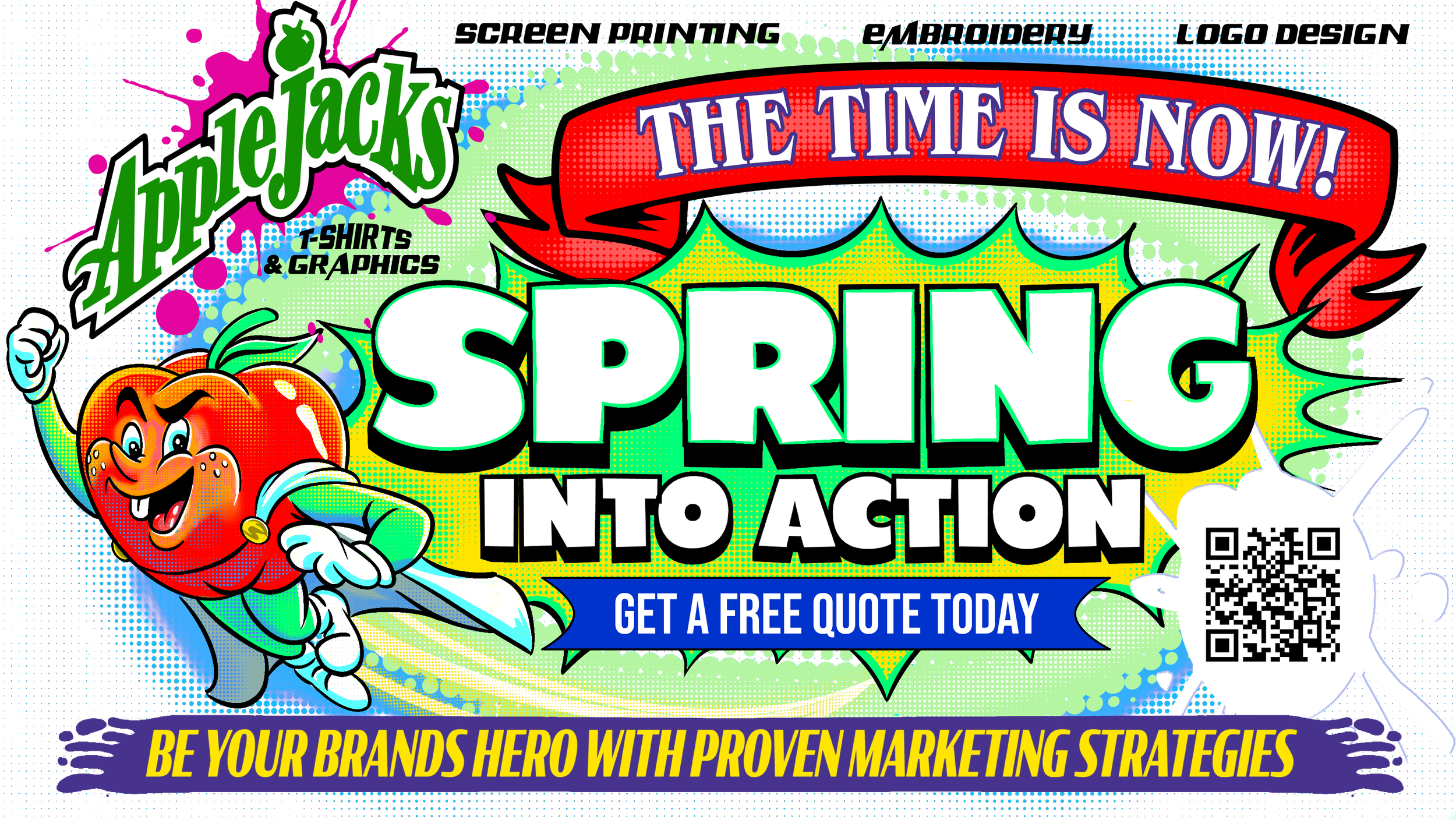
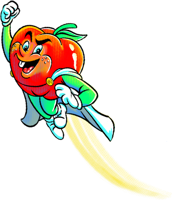
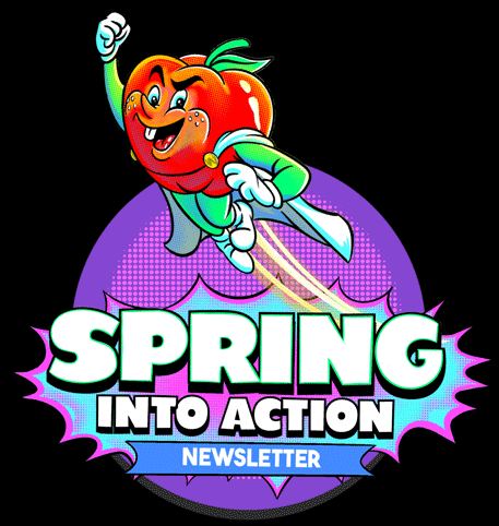
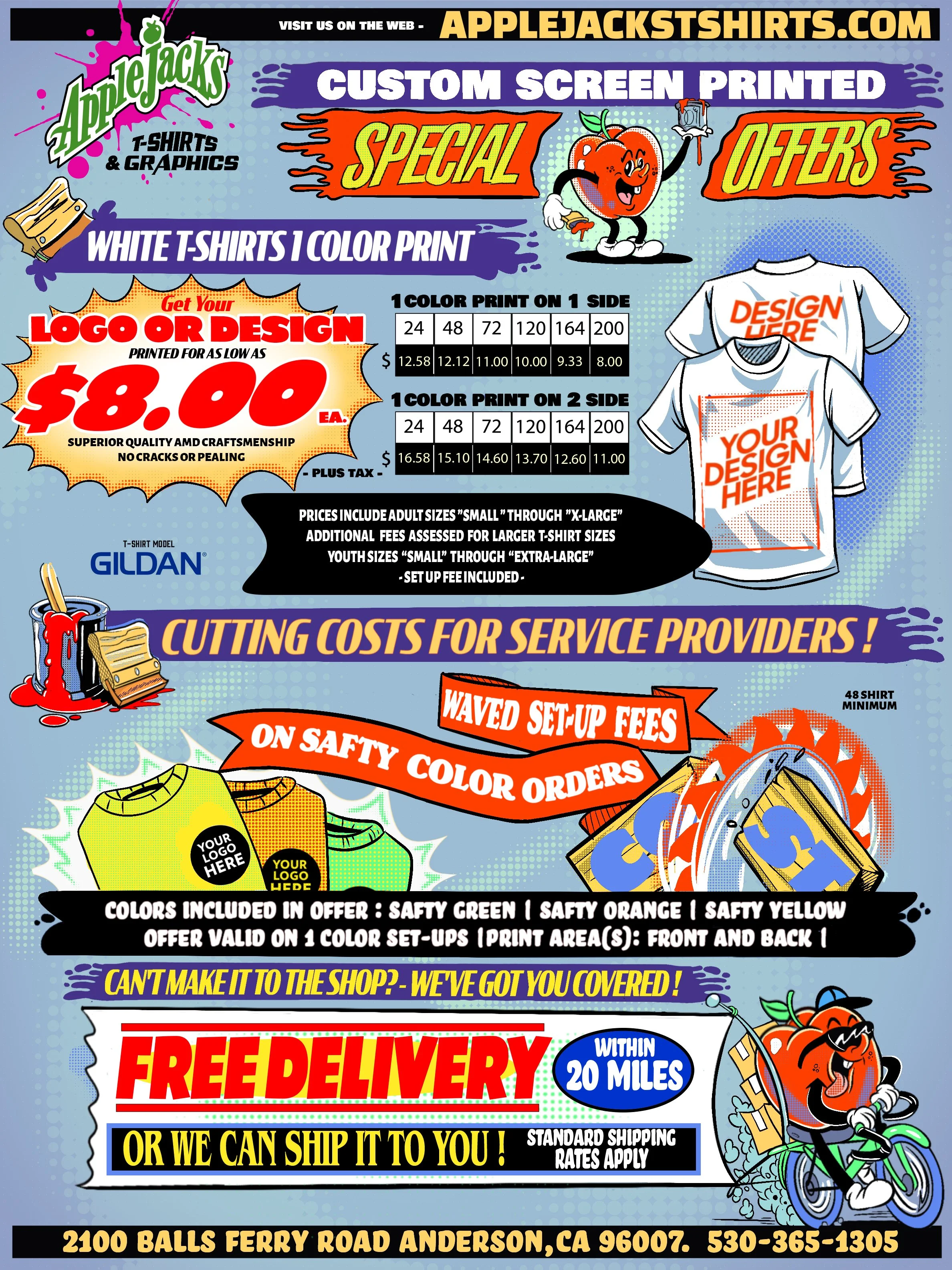
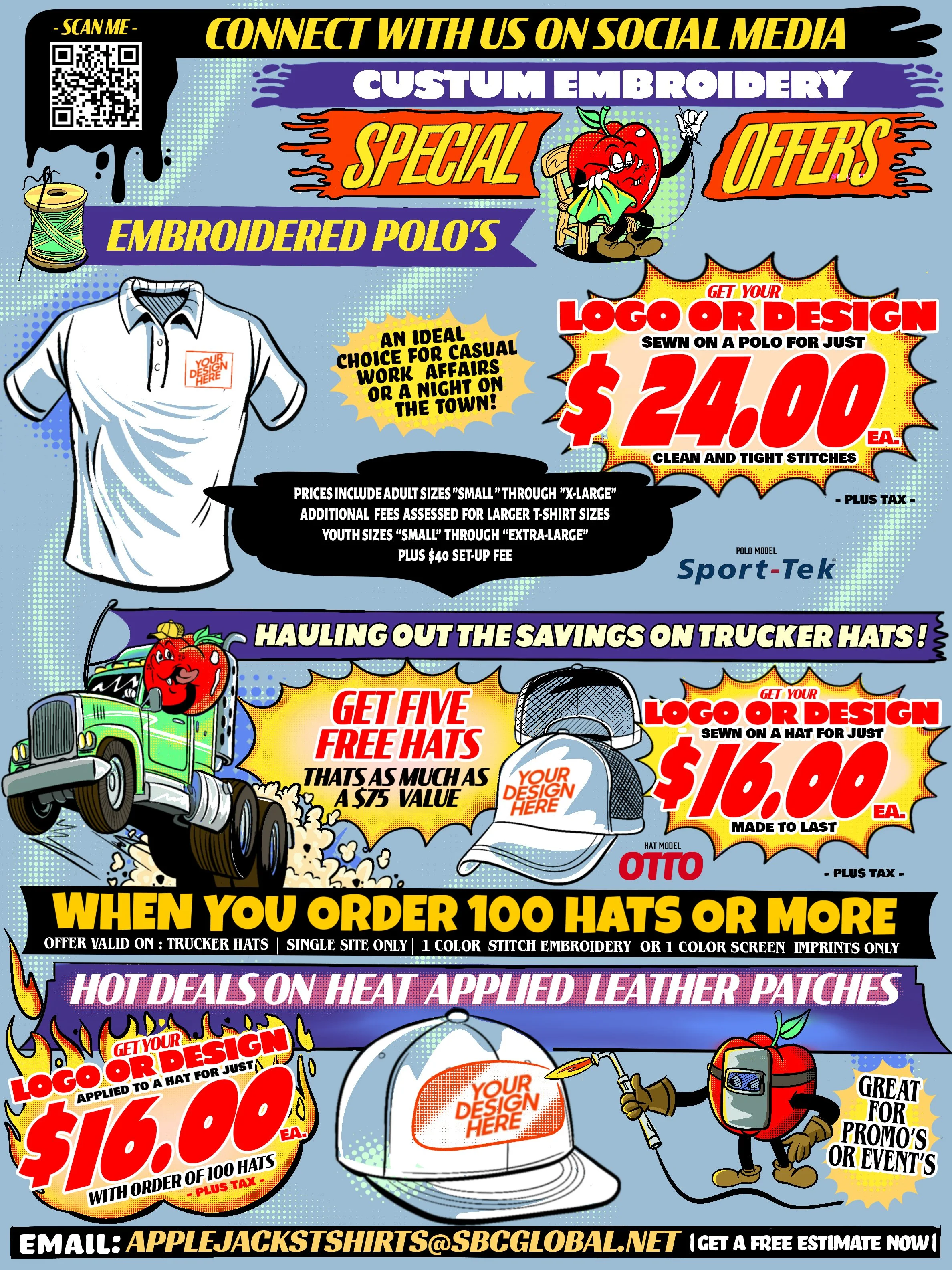
Applejacks spring Campaign
The campaign represented a great opportunity to take an established business with almost no social media exposure and out of date online presence and supercharge their engagement with clean, targeted ads that not only generated leads, but converted them
Static Campaign
Deployed across both digital and printed mailing campaigns.
Designed with CTA hierarchy, modern retro appeal, and visual pacing.
presented Applejacks as a local player with professional polish.
Physical Mailer
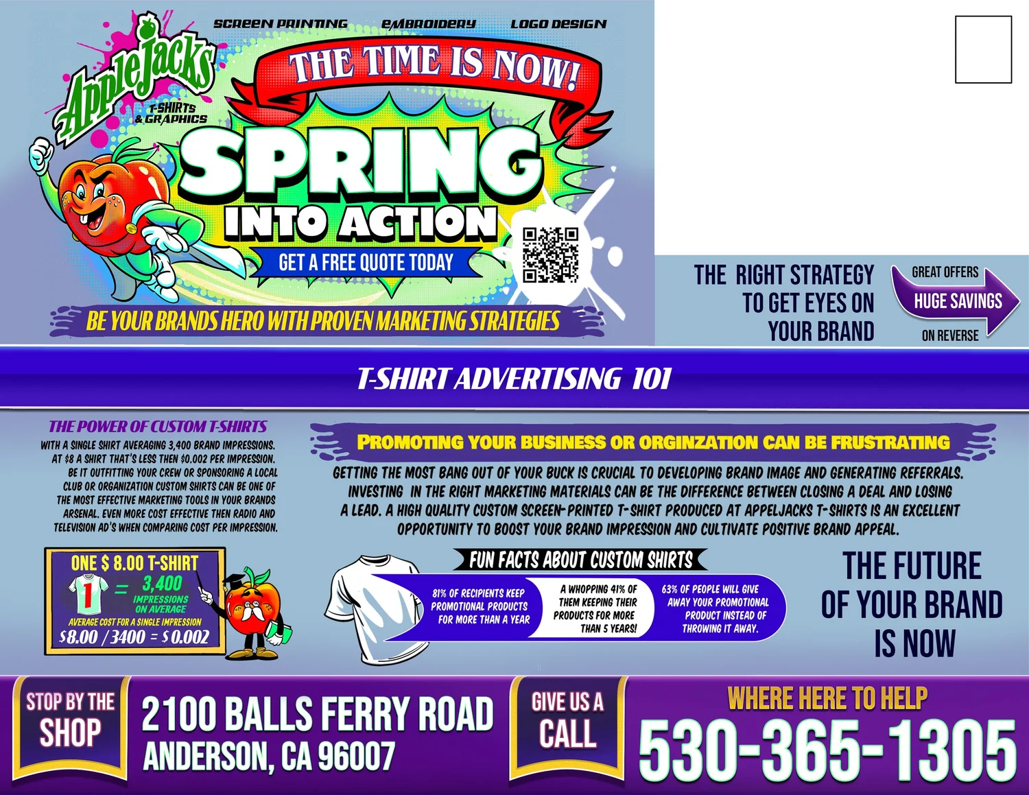

eLECTRONIC CAMPAIGN fLYER
The Campaign Video
30-second promotional video tailored for digital distribution.
Logo animation and high-contrast energy gave it visual stickiness.
Delivered a clear identity without narration - music, visuals, and hot rods did the talking.
“30 second process ad”
Hot off the Press
A curated look at logo animations and visual accents that brought Applejack’s digital presence in to the spotlight putting the brand center stage in every frame and giving it momentum with every scroll.
The Strategy
-
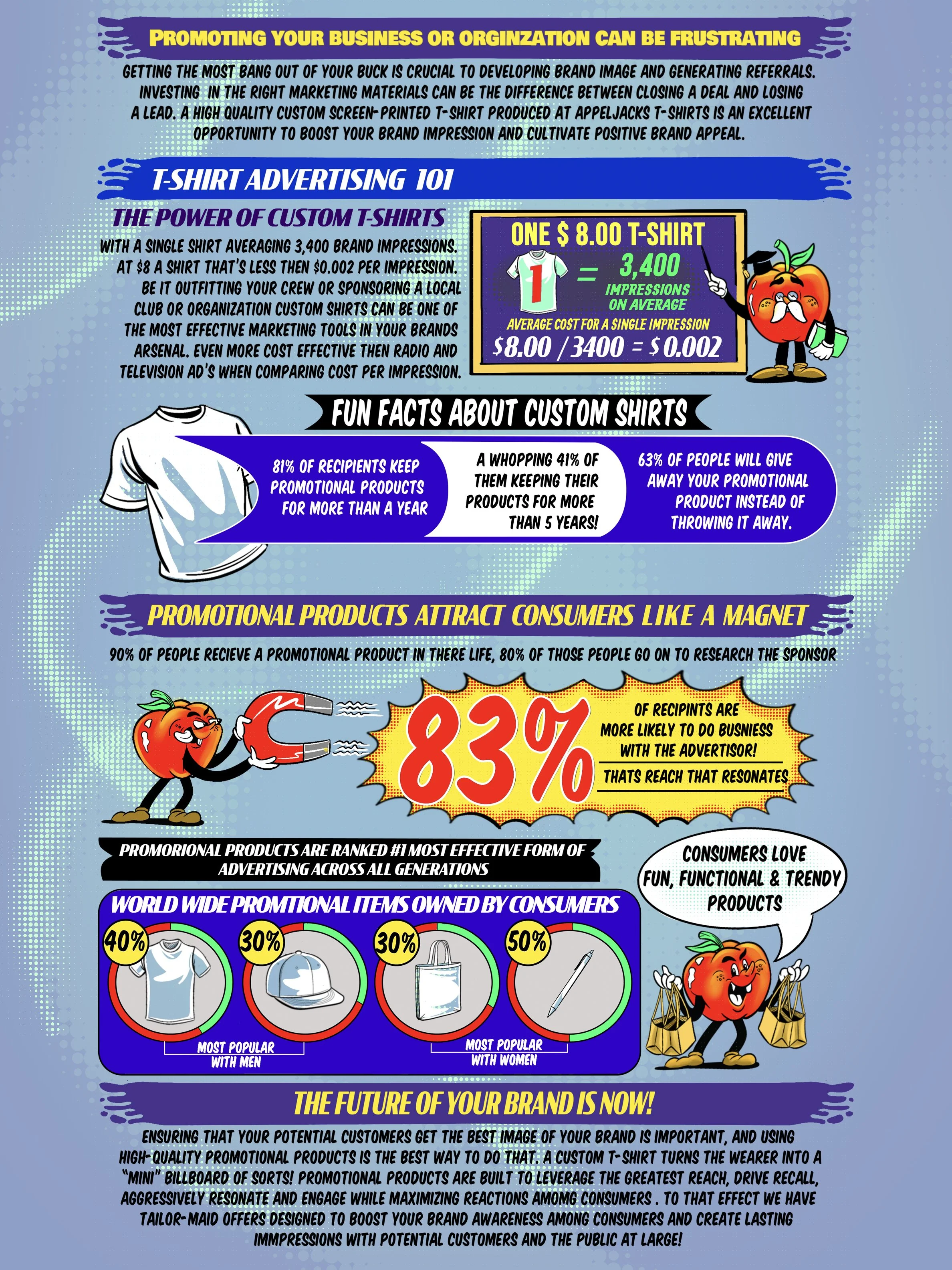
Capture interest with bold design and cartoon illustrations across relatable trades.
Bridge the gap between traditional outreach and digital-first presence.
Emphasize promotional branding as a sales growth lever.Description text goes here
-
Fun, stylized illustrations rooted in Americana and contractor culture.
Strong emphasis on industry-recognizable scenarios to build familiarity.
Sharp, high-contrast layout for visibility across print and screen.
-
Custom animations added charm and polish to the digital rollout.
Reinforced memorability with logo motion and real-world printing footage.
Created a full-circle visual narrative from concept to production.
-
Playful, punchy, and skill-forward.
Communicated craftsmanship, humor, and approachability.
Reinforced legitimacy through quality design and consistent assets.Item description
The result? A brand that didn’t just speak - it showed. From ink hitting fabric to every frame of the animation, the message was clear: Applejacks delivers quality you can see and trust. With every scroll, click, and view, the story gained momentum.
attention
the brand earned
and took control of thier image
Take control of your audience’s perception and Be the master of your own story.
Let’s turn maybe into sold
starting today.
So What’s Your Story?
Let’s build a brand they’ll remember - one frame at a time